The two pie charts below show some employment patterns in Great Britain in 1992.
Summarise the information by selecting and reporting the main features, and make comparisons where relevant.
Write at least 150 words.
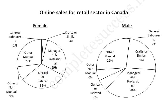
The charts provide information on the proportion of males and females in employment n 6 broad categories, divided into manual and non-manual occupations.
Overall, a greater percentage of women work in non-manual occupations than work in manual occupations, and the reverse is true for men.
In the non-manual occupations, while a greater percentage of working women than men are found in clerical-type positions, there is a smaller percentage of women than men employed in managerial and professional positions, The percentage of women employed in other non-manual occupations is slightly larger than the percentage of men in these occupations.
In manual employment, the biggest difference between the two sexes is in the employment of craft workers, where males make up 24% of the workforce and females just 3%. Furthermore, the percentage of women working as general working as general labourers is very small, only 1%. There is not a great deal of difference between the percentage of men doing other forms of manual work (26%) and women in other manual work (27%). In summary, the two charts clearly show that women do not have the same access as men to certain types of employment.
(194 words)