The line graph below shows the percentage of tourists to England who visited four different attractions in Brighton.
Summarise the information by selecting and reporting the main features, and make comparisons where relevant.
Write at least 150 words.
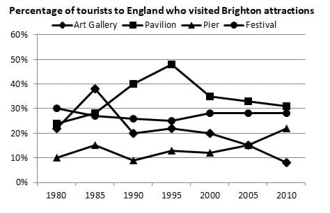
The line graph shows the percentage of tourists to England who visited certain Brighton attractions between 1980 and 2010. We can see that in 1980 and in 2010 the favourite attractions were the pavilion and the festival. In 1980 the least popular attraction was the pier but in 2010 this changed and the art gallery was the least popular.
During the 1980s and 1990s there was a sharp increase in visitors to the pavilion from 28% to 48% and then the percentage gradually went down to 31% in 2010. The trend for the art gallery was similar to the pavilion. Visitors increased rapidly from 22% to 37% from 1980 to 1985 then gradually decreased to less than 10% over the next twenty-five years. The number of tourists who visited the Brighton Festival fluctuated slightly but in general remained steady at about 25%. Visitors to the pier also fluctuated from 1980 to 2000 then rose significantly from 12% to 22% between 2000 and 2010.
(163 words)