(7+ Band Task 1)
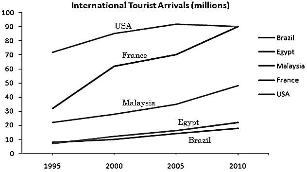
The provided line graph compares the changes in the number of overseas travellers who visited Brazil, Egypt, Malaysia, France and USA from 1995 to 2010.
Overall, every country witnessed an increase in the number of tourists however the growth was particularly noticeable in France.
In detail, USA and France were main attractions popular among tourists. USA was the most visited country throughout the years. In 1995, 70 million visitors came to see it which was more than twice the visitors (30 million) in France. In the next 10 years, the number of visitors in USA increased to 90 million and then levelled out. The visitors in France grew at much faster pace in first five years and matched the figure of USA in 2010.
In contrast, with moderate number of visitors Malaysia stood at third position in favourite tourist destinations. The travel to this country doubled in the span to 15 years. Egypt and Brazil, on the other hand, were visited by comparatively few numbers of tourists as the value of tourists’ arrival was less than 10 million in both the countries in 1995. They managed to attract only 5 to 10 million more travellers till 2010 where Egypt performed slightly better than Brazil.
(6 to 6.5 Band Task 1)
The Given Line graph demonstrates how many visitors visited five overseas countries namely Brazil, USA, France, Malaysia and Egypt in 15 years.
Overall, France and USA became increasingly popular among tourists whereas Egypt and Brazil witnessed a minor jump in there tourism industry.
In detail, around 70 million tourists came to USA in 1995. This value surged to about 90 million in 2005 and remained almost constant for next five years. France, on the other hand, was visited by 30 million travellers in the beginning of the given period. A dramatic increase was seen in the number of visitors in the first five years where the visits became two fold. In next 10 years, the value rose to same value as that of USA.
In contrast Malaysia was preferred by 20 million international tourists in 1995. This moderate number grew to approximately 45 million in the end. A small number of travellers chose to visit Egypt and Brazil in 1995. The visitors did increase in both the countries but with marginal number. Both the values increased by 5 and 10 million in Brazil and Egypt respectively in 15 years.
The line graph illustrates the data about the number of people who visited North America, Central and Eastern Europe, South-East Asia, Sub-Saharan Africa and South America between 1990 and 2005.
Overall, what stands out from the graph is that the total quantity of tourists rose in all five parts of the globe. However, Sub-Saharan Africa and South America witnessed an extremely narrow gap between them, compared to the others.
Looking at the details, as regards North America, the number of tourists stood at 70 million in 1990, which was the highest total. There was a gradual rise to 90 million for a decade, the figure then levelled out until the end of the period. Next, beginning at 30 million in 1990, Central and Eastern Europe experienced a dramatic increase in the number of international tourists, rocketing to nearly 90 million. Then, third on the rank was South-East Asia, where the number in 1990 went up progressively from 20 million to just over 40 million in the final year, making the sum slightly two times more than the original total.
As for Sub-Saharan Africa, even though the statistics of tourists started at approximately 7 million in 1990, the figure was the lowest total throughout the given period. Despite being the least popular destination, the number grew steadily and promptly overtook South America in around three years. Subsequently, the final sum was roughly around 20 million for Sub-Saharan Africa as opposed to South America with 15 million.