The chart below shows the number of travellers using three major airports in New York City between 1995 and 2000.
Summarise the information by selecting and reporting the main features, and make comparisons where relevant.
Write at least 150 words.
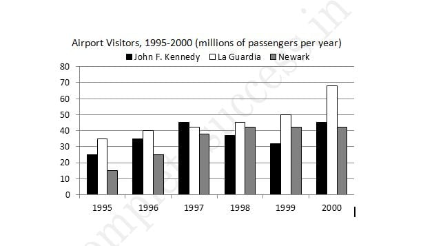
The bar chart gives information about how many people visited New York City through three major airports, over a six-year period between 1995 and 2000.
Overall, it can be seen that over the period, there was a fluctuant trend in the number of passengers who travelled via John F. Kennedy airport, while the other two airports saw an upward trend. Another interesting point is that LaGuardia airport was the most popular at the end.
Looking at the detail, the number of travellers at John F. Kennedy airport started at 26m in 1995 and then increased remarkably to reach the highest point of 47m in 1997. In 1999, the figure dipped to 32m. At the last year, there was a slight growth to 44m. On the other hand, LaGuardia began at 35m in 1995, after that it rose remarkably for the next three years, at 46m, In 2000, LaGuardia hit the peak point at 68m travellers.
However, if we look at Newark airport, it started at the lowest point of 16m passengers in the first year. After this point, the trend increased significantly to 42m in 1998. In the last two years, it remained stable at 42m travellers.
(197 words)